Effectiveness study | Mixed methods | Comparative evaluation
Does concept mapping earn its place?
A four-month controlled study of whether a visual note-taking tool helps an underserved, high-churn segment keep pace — measured on performance, engagement, and the quality of what students produced.
51
Participants compared
d = .58
Higher course interest
r = .65
Map quality → grade
98%
Coder agreement
Project overview
International students are one of the largest and fastest-growing segments in U.S. higher education — and one of the highest-churn. Many struggle and leave before finishing. The reasons look familiar to anyone who studies an underserved user group: the experience wasn't built for them. Material moves fast in a second language, tests reward a style of test-taking they were never trained for, and the default tool — bullet-point notes — doesn't help them connect or hold onto ideas.
I wanted to know whether a different tool would move the needle. Concept mapping is a visual note-taking method: instead of a linear list, you lay out how ideas connect. The real question wasn't whether it sounds good — it's whether it measurably helps the people who need it, in a live course, over four months.
So I designed and ran a controlled comparison in an introductory economics course. One section of international students learned and used the tool; a comparable section was the baseline. The honest result is a nuanced one. The tool wasn't a cure — but the students who used it kept pace with their domestic peers on exams and participation, with no significant gap, while rating the course significantly more interesting. And the better a student's maps, the higher their final grade.
Role: Sole researcher — design, analysis, and reporting
Methods: Controlled comparison, rubric scoring, motivation survey, interviews
Measures: Quizzes, midterms, concept-map scores, participation, 15 interviews
Context: Introductory economics, fully online, four months
Foundation: My University of San Francisco Ed.D. dissertation
Where international students get stuck
Three everyday frictions in a second-language classroom — and the outcome they add up to.
My contributions
I ran this study end to end as the sole researcher — I framed the question, chose the design, built the instruments, ran the analysis, and wrote it up. Every methodological call was mine to make and defend.
I built a comparison that could actually answer the question: one section of international students learning the tool, one comparable section as the baseline, same instructor and same tests, so the tool was the only thing that differed. Then I shipped the intervention into a live course — training the instructor, onboarding students, and building six mapping assignments into the normal homework rather than bolting on extra work.
To measure the maps fairly, I adapted a four-part scoring rubric and double-rated 282 maps with a second rater, calibrating first so our scores held together. I ran the quantitative analysis myself — performance trends over time, group comparisons with effect sizes, and the correlation between map quality and final grade.
Numbers alone don't explain themselves, so I paired them with 15 interviews, coded the transcripts, and checked the coding with a second coder, member checks, and peer debriefing — so the story of why the numbers came out the way they did is as defensible as the numbers themselves.
How I measured it
A controlled comparison over four months, built so the findings would hold up under scrutiny — not just look good.
DESIGN
Controlled comparison
One section used the tool; a comparable section was the baseline. Same instructor, same course, same tests — the tool was the only difference. 26 international students vs 25 mostly-domestic peers.
MEASURES
Performance, engagement, behavior
Six quizzes and two midterms; a 15-item motivation survey (usefulness, success, interest) in English and Mandarin; six rubric-scored mapping assignments; and 15 interviews to explain the numbers.
RELIABILITY
Built in, not assumed
Two raters calibrated, then double-scored 282 maps — ICC .68, quadratic-weighted κ .68. Motivation subscales α .89–.92. Interview coding cross-checked by a second coder at 98%.
What students told me
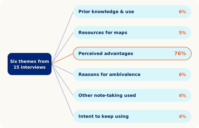
I coded the 15 interviews into six themes. One dominated: the advantages of the tool made up 76% of everything students talked about, and 14 of 15 said they would keep using it.
Results in detail
The story above is in the language a design team uses. The statistics below are for a reader who wants to see the tests behind it.
Outcomes & impact
On par
Exams & participation
d = .58
Higher course interest
r = .65
Map quality → final grade
282
Maps double-scored
98%
Interview-coder agreement
14 / 15
Would keep using it
Reflection
What worked
The controlled comparison and the interviews together. The numbers showed the tool group kept pace and engaged more; the interviews explained why. Neither on its own would have been convincing.
What I learned
The honest finding was the useful one. “Kept pace” isn't a flashy headline, but for a group that English-heavy testing usually disadvantages, closing the gap is the result that survives scrutiny.
What I'd improve
The sample was small and all from one country. I'd run it larger and across more backgrounds, and treat prior knowledge and English proficiency as factors to analyze rather than noise to absorb.
More research
Each project tells a different part of the story.
Member Touchpoint Optimization
$22.6M revenue protected
Uncovered the systemic causes of member-communication overload.
View case study → B2B · Internal Analyst ToolClaim Audit Platform
$20M est. annual savings · 91.4 SUS
Mapped an eight-plus-system audit workflow into a consolidated redesign.
View case study → Enterprise · Member AnalyticsHealthcare Explorer Redesign
89% desirability · silent failures caught
Caught three tasks users were sure they'd completed but hadn't.
View case study →