Enterprise Healthcare UX Research | UHC E&I Advocacy | Member Analytics
Healthcare Explorer Redesign
A member-analytics tool that tested as confusing and learning-curve-heavy. I led the research that drove a redesign — then validated it, and caught three tasks users were sure they had completed but hadn't.
89%
Positive desirability
3
Silent failures caught
6
Think-aloud tasks
Shipped
Urgent fixes
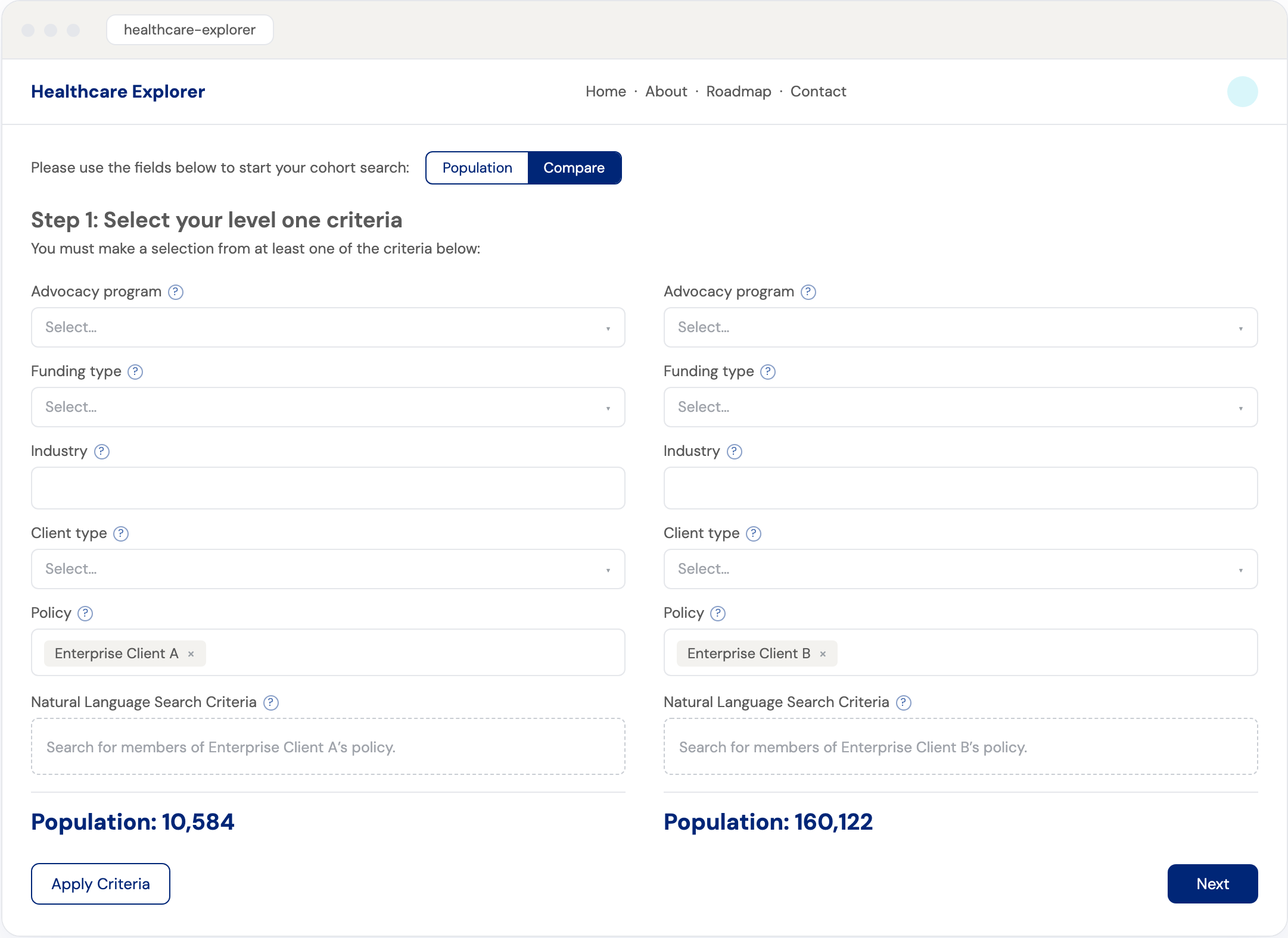
An AI feature I recommended — natural-language criteria
From the research, I pushed for a natural-language layer on top of the structured filters: analysts pick filters and the field auto-writes a plain-English sentence describing the cohort — or they type their own query to build it — and that same sentence carries through into the generated report.
How I think about it: an AI feature earns its place when it meets people whichever way they frame the question and keeps the query legible and checkable end to end. A cohort you can read back in plain English is one you can trust you built right — the quiet antidote to the “confident, but wrong” failures the study later exposed.
Project overview
Healthcare Explorer was built for UnitedHealthcare's E&I Advocacy team — the concierge support arm of an Employer & Individual division serving roughly 26.6 million members. Employers buy the Advocacy benefit to help members navigate the healthcare system and, in turn, lower their total cost of care.
Healthcare Explorer is the internal platform built to do that at scale: cohort analysis and member journeys that surface 360-degree member insight in minutes instead of weeks, so analysts can catch a member's care gaps and reach out before a coverage denial becomes a frustrated member heading for the exit. But its first version tested badly — new users didn't know where to start, core terms were unclear, and people described the experience as Difficult, Confusing, and Disorganized.
I was the UX researcher. After the original study surfaced a steep learning curve and four clusters of problems, the team redesigned the tool — building in the natural-language criteria layer I'd recommended — and I ran a mixed-method usability and desirability study to check whether it actually fixed them.
The redesign tested 89% positive on desirability. But pairing task success with confidence exposed what a satisfaction score alone would have hidden: three tasks where users felt sure they'd succeeded but hadn't. Those silent failures became the prioritized fix list the design team shipped.
Role: UX Researcher
Methods: Remote moderated usability testing, desirability (reaction-card) test, think-aloud, confidence & ease ratings, NPS
Client: UnitedHealthcare E&I Advocacy team
Users: the team's advocacy analysts
Cohort data: anonymized enterprise national accounts
Impact: 89% positive desirability · 3 urgent fixes shipped
My contributions
I owned this study as the UX researcher — designing the protocol, moderating the sessions, analyzing the data, and turning it into the recommendations the design team built from — including the natural-language AI feature I championed, a plain-English layer over the structured filters.
The redesign was already testing well on the surface, so the real question was whether “feels good” actually meant “works.” My most important decision was to pair every task’s success rate with how confident users felt completing it — because a task users fail but feel sure they passed is the most dangerous kind: a silent failure that never shows up in a support ticket.
That lens turned a positive readout into a precise, ranked fix list. I translated each finding into a specific design recommendation — untangling an ambiguous “add criteria” step, surfacing buried menus, and replacing internal jargon with plain language.
The work didn’t end in a deck. The design team implemented the recommendations, and the three urgent fixes shipped ahead of the wider rollout.
The challenge
The first version put powerful member-cohort analytics behind a confusing front door. The original usability study made the cost clear — task success fell as low as 1 in 8, and satisfaction averaged just 2 of 5 (1.5 for first-time users).
STEEP LEARNING CURVE
New users didn't know where to start, and several needed coaching to finish a basic task.
UNCLEAR LANGUAGE
Core terms didn't land — one tester didn't know that “policy” referred to the member cohort itself.
NEGATIVE PERCEPTION
Users described the original as Difficult, Confusing, Time-consuming, and Disorganized.
How I tested the redesign
A mixed-method usability and desirability study — 8 participants, 6 think-aloud tasks — built to measure not just whether the new design worked, but how sure users felt while using it.
EVALUATIVE
Think-aloud tasks
8 participants worked through 6 realistic cohort-analysis tasks, narrating what they were doing and why.
PERCEPTION
Desirability test
After tasks, participants chose from 16 reaction-card adjectives — a fast read on how the design felt.
SIGNAL
Confidence & ease
A post-task confidence rating plus a Single Ease Question — the pairing that surfaced the silent failures.
BENCHMARK
First impressions & NPS
A one-minute first-impressions test on the primary screen, plus an end-of-study NPS.
The framework: success × confidence
Most usability readouts stop at a success rate. I paired task success with participant confidence — because the dangerous quadrant is the one a success rate alone can’t see: users who fail but feel sure they succeeded. Those are silent failures, and they quietly corrupt every decision built on the data they produce.
succeeded
failed
silent failures
Why it mattered here
The redesign scored 89% positive on desirability — by every surface measure, a win. But three tasks landed in the orange quadrant: low success, high confidence. Users walked away certain they’d pulled the right cohort.
In a tool that feeds downstream decisions, a confident wrong answer is worse than an obvious failure — so those three became the urgent fixes, ahead of everything that merely “tested fine.”
The data behind the quadrants
Every task scored on success, confidence, and ease. Tasks 2, 4, and 6 score high on confidence and ease yet fail on success — the silent-failure signature, flagged for urgent iteration.
| Task 1 apply a saved filter | Task 2 add a new criterion | Task 3 find the issue filter | Task 4 find the event filter | Task 5 open the compare view | Task 6 go straight to analytics | |
|---|---|---|---|---|---|---|
| Task success | 87.5% | 37.5% | 87.5% | 50% | 100% | 37.5% |
| Confidence · /7 | 6.6 | 6.2 | 6.65 | 5.95 | 6.9 | 5.6 |
| Ease · /7 | 6.6 | 6.25 | 6.55 | 6.0 | 6.9 | 6.6 |
| Call | No change | Urgent | No change | Urgent | No change | Urgent |
What the validation found
The redesign reversed the original’s reputation — and the success-vs-confidence read pinpointed exactly where it still needed work.
Original
Difficult
Confusing
Disorganized
Redesigned
Satisfied
Effective
Confident
Desirability
89%
positive reactions — 178 of 200 word choices
Where confidence outran success
3 of 6
tasks ready to ship — high success, high confidence
3 of 6
flagged urgent — as low as 37.5% success, yet near-top confidence
100%
of the urgent tasks turned into shipped fixes
How a “successful” task silently failed
The silent failures shared one root cause: an “add something, then move on” model that never signaled what was actually required. The “Add Criteria” control, for one, was required in some steps and optional in others — and “Next” quietly discarded any selection a user had started but not explicitly added. Here’s how that played out in one representative task: six linear-looking steps to a cohort, two of them silent traps.
Step 1 · the hidden “Add Criteria”
4 of 8 users didn’t realize they had to click “Add Criteria” before moving on. The filter never registered — yet they continued, sure the cohort was set.
Step 3 · the buried menu
4 of 8 users never noticed the drop-down was there to make the selection — so the value was never applied to the cohort.
Every participant reached a result and rated their confidence high — yet the cohort was built on selections that never registered. It was the same trap each time the tool asked users to add something and proceed: “Next” quietly advanced past anything not explicitly added, in a flow that never signaled what was required — one ambiguity that pushed three of the six tasks into the danger zone. Exactly the failure the success-vs-confidence read was built to surface.
The three breakdowns — and the fixes
“Add Criteria” worked two opposite ways
Required in some steps, optional in others — and “Next” silently dropped any selection a user hadn't explicitly added, so they moved on sure the query was complete. Fix: flag when a step still needs input, make clear what “Next” keeps versus skips, and confirm before discarding a half-finished selection.
Buried selection menus
Half of users didn't notice a drop-down was there to make a needed selection. Fix: surface the control so the choice is visible, not discovered.
Jargon with no explanation
An internal term left users guessing what it meant. Fix: add a plain-language tooltip so the label teaches itself.
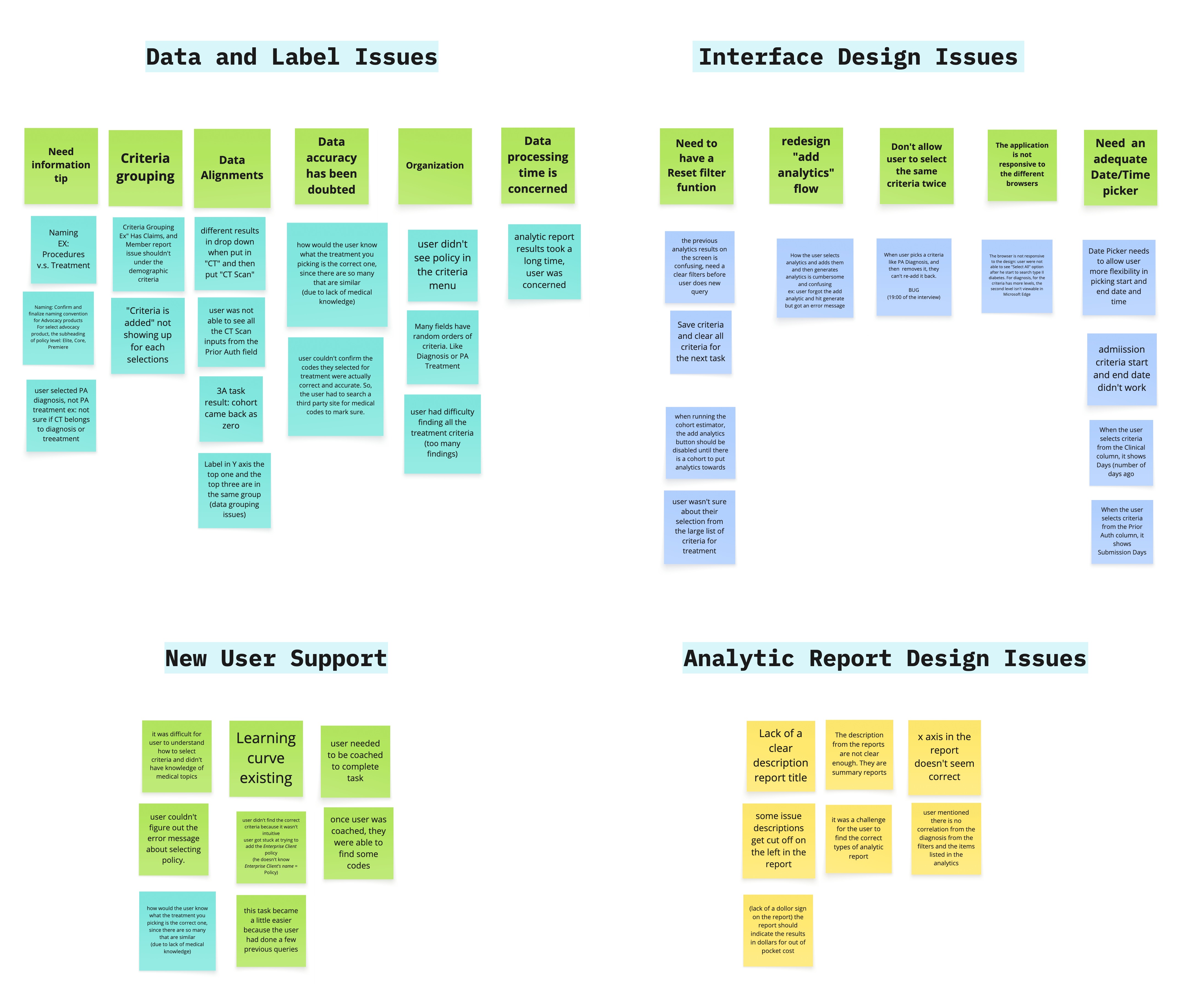
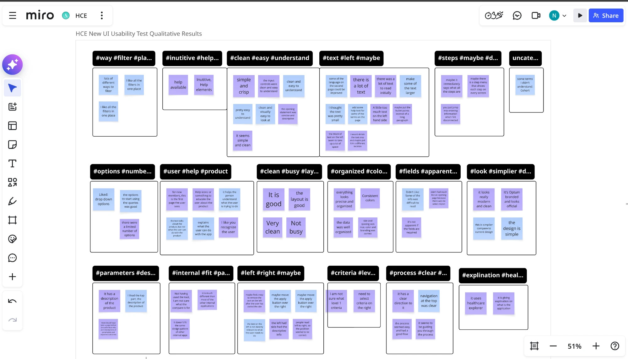
The affinity analysis behind the findings
Those scores came from somewhere. I affinity-mapped every open-ended comment from both rounds — the qualitative backbone behind the numbers. Click either board to read the themes.
What shipped: the guided redesign
The design team rebuilt the criteria flow from my findings. The “Add Criteria / Next” trap that produced the silent failures is gone — replaced by a guided, step-by-step wizard.
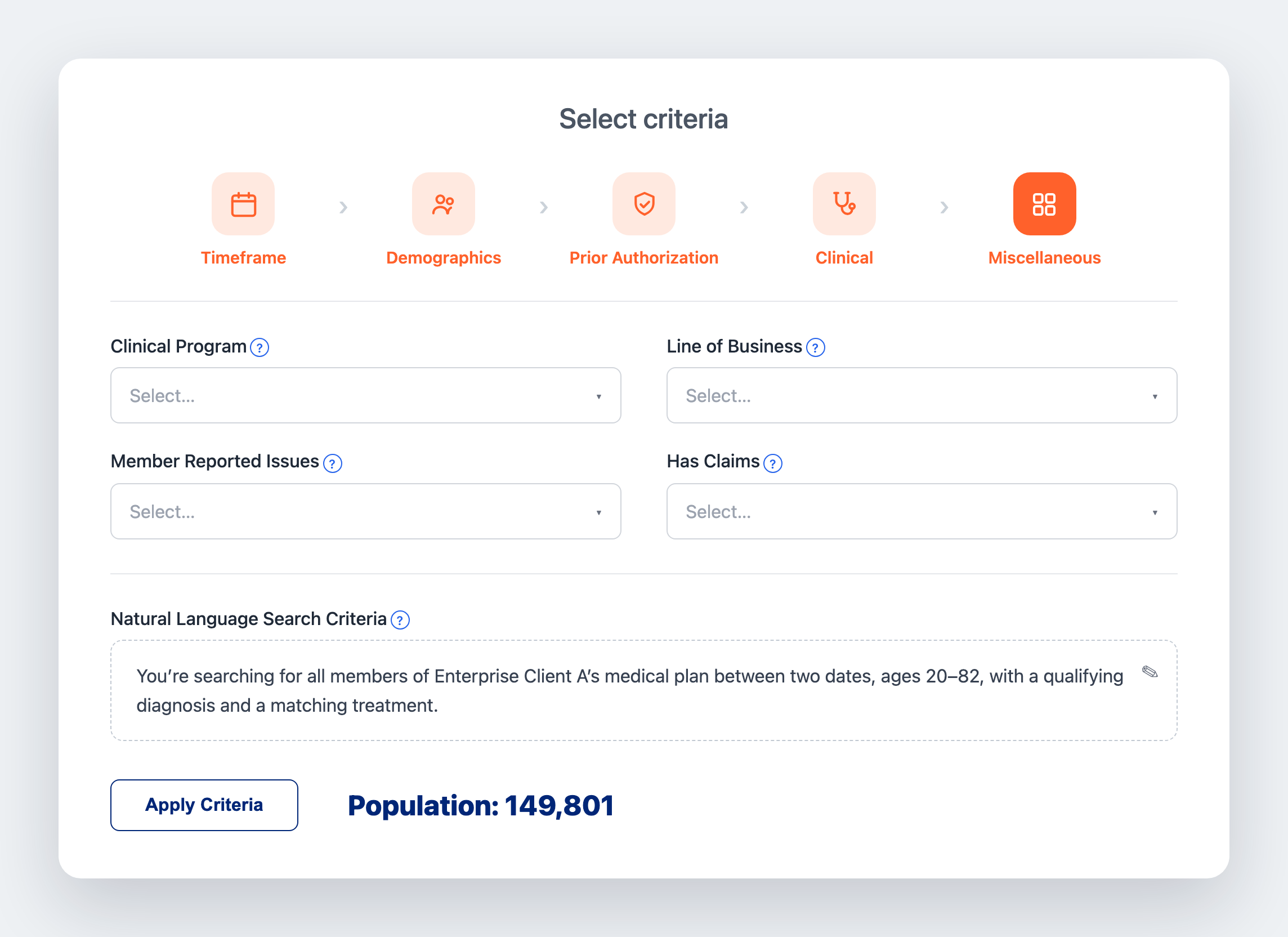
A guided five-step flow
Timeframe through Miscellaneous, with a progress bar — no one starts lost or loses their place mid-query.
One explicit “Apply Criteria”
A single, unmistakable commit. “Next” no longer silently skips an unfinished selection.
Labeled fields with tooltips
The buried dropdowns are surfaced, and the “indexing event” jargon is explained in place.
The natural-language layer, shipped
The plain-English summary I’d recommended — auto-written from the filters, and carried through into the report.
Outcomes & impact
89%
Positive desirability
3
Urgent fixes shipped
6
Tasks tested
8
Participants
AI feature
Recommended, then shipped
2
Research rounds
Reflection
What worked
Pairing success with confidence caught failures a satisfaction score would have greenlit — and gave the team a ranked, defensible fix list instead of a vague “keep polishing.”
What I learned
Satisfaction is not usability. The most valuable finding wasn't that people liked the redesign — it was the tasks they were confidently getting wrong.
What I'd improve
I'd run an unmoderated round on the shipped fixes to confirm the silent-failure tasks actually closed, and track task success in production.
More research
Each project tells a different part of the story.
Member Touchpoint Optimization
$22.6M revenue protected
Uncovered the systemic causes of member-communication overload.
View case study → Effectiveness Study · Higher EducationDoes concept mapping earn its place?
Kept pace · r = .65 map-to-grade
A controlled comparison testing whether a note-taking tool helps international students keep pace.
View case study → B2B · End Users: MA State ResidentsMassachusetts Health Connector Heuristic Evaluation
134 violations · 350K+ residents
A four-person expert review of enrollment workflows, turned into a state-level roadmap.
View case study →