ENTERPRISE HEALTHCARE UX RESEARCH | MASSACHUSETTS HEALTH CONNECTOR | HEURISTIC EVALUATION
Massachusetts Health Connector Heuristic Evaluation
The Massachusetts Health Connector is the coverage marketplace for 350,000+ residents — and its most-used workflows were riddled with usability barriers. A 134-violation audit showed exactly why — and gave the state a clear path to fix it.
350K+
Residents served
134
Usability violations
63
High severity issues
4
Expert evaluators

Project overview
The Massachusetts Health Connector is the health insurance marketplace for Massachusetts residents, families, and small businesses. For many users, it's the only path to coverage — which makes every usability barrier a real-world consequence, not just a friction point.
When the platform drew consistent feedback that residents struggled to navigate enrollment and account management, I was brought in to lead a rigorous, multi-evaluator heuristic review across the seven workflows residents depend on most — from creating an account to submitting a completed application.
What we found was systemic. Across 134 identified violations, the platform's most-used journeys were riddled with navigation dead-ends, walls of text, missing progress indicators, and no reliable way to recover from errors. 71 of those violations were moderate to severe.
The findings were translated into a prioritized, actionable recommendation set that informed real design changes — and established a reusable evaluation framework for other state health portal projects.
Role: Lead UX Researcher
Team Size: 4 UX Researchers
Method: Multi-Evaluator Heuristic Evaluation (Monkman, 2013)
Client: Massachusetts State Government
Stakeholders: Optum State Government Solutions (OSGS), Optum Insight
Scope: 7 Critical User Workflows · 134 Violations Identified
Engagement Type: B2B · End Users: Massachusetts State Residents
My contributions
I led this project end to end — from aligning with the project manager on goals and success criteria, through training and calibrating three fellow evaluators, to presenting findings and recommendations to state government stakeholders.
The methodological decisions were mine to make. I selected Monkman’s (2013) heuristic framework as the evaluation standard, defined the seven target workflows with stakeholders, and built the MUIQ evaluation form that gave all four evaluators a consistent basis for independent review. Calibration mattered here — with four researchers working in parallel, inconsistency in how we rated severity would have undermined the entire output. I developed the training materials that held that consistency together.
After independent evaluations were complete, I led the aggregation process: de-duplicating findings, applying severity ratings, and grouping violations by workflow to surface where the most critical issues clustered. That prioritization work turned 134 raw issues into a targeted, defensible recommendation set that product and design teams could act on immediately.
The final deliverable wasn’t just a findings report — it was framed as a reusable case study for state health portal evaluations, extending the value of the work beyond a single engagement.
While this was a B2B engagement delivered through Optum State Government Solutions, the end users were Massachusetts residents — many with limited health literacy, varying levels of digital fluency, and urgent coverage needs. That dual audience dynamic shaped every research and recommendation decision.
Why this matters
350K+
Massachusetts residents served
The Health Connector supports critical healthcare enrollment and account management workflows. Usability barriers in these workflows could increase user effort, reduce completion confidence, and make it harder for residents to access coverage-related information.
PAIN POINT
Users encountered navigation and task recovery barriers across enrollment workflows.
OPPORTUNITY
Improve usability, learnability, and content clarity across high-impact user journeys.
BUSINESS RISK
Unresolved usability issues could affect enrollment completion, user confidence, and service accessibility.
Evaluation process
How the collaborative heuristic evaluation ran end to end — the people, activities, methods, and purpose at each stage, from preparation through the final stakeholder readout.
stages
involved
steps
tools
arc
insights
Understanding critical user journeys
The evaluation focused on seven high-priority workflows, including eligibility, enrollment, account management, and application submission.
Why these seven journeys
The platform had drawn feedback that it was hard to navigate and that residents struggled to complete enrollment-related tasks. So the evaluation centered on the seven journeys residents depend on most — the path from creating an account to submitting an application.
A CONNECTED PATH
The seven journeys form one connected flow — account, eligibility, plan shopping, enrollment, and application — so friction early on ripples through everything that follows.
WHY THEY'RE HIGH-STAKES
These are the tasks a resident can't skip to get covered, which is why usability problems along this path were the evaluation's top priority.
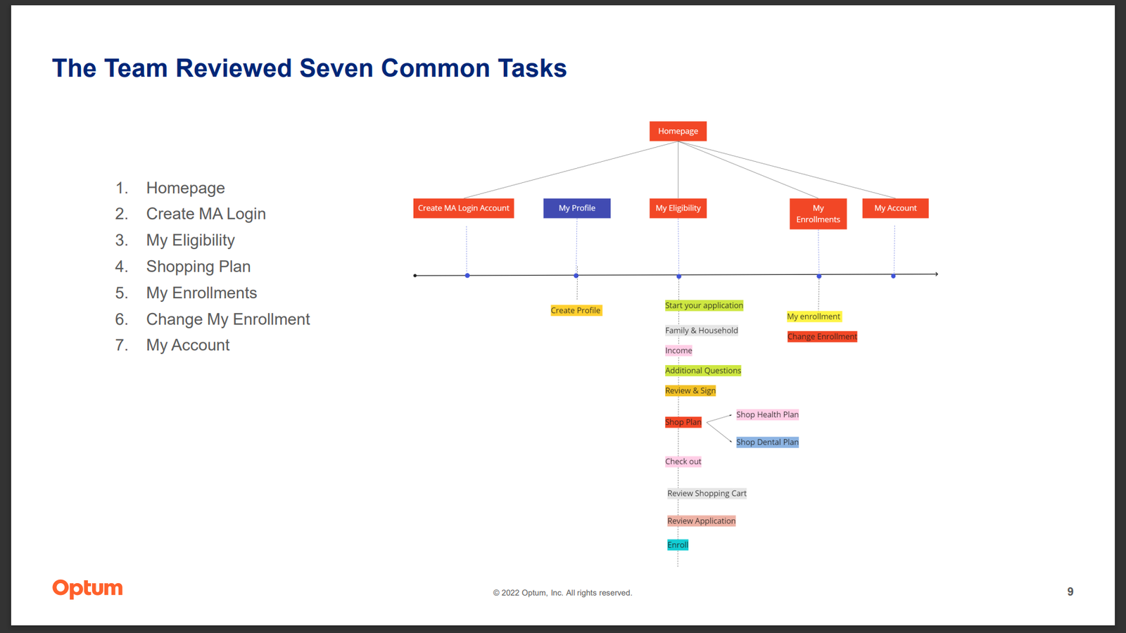
Critical journey map showing the seven workflows reviewed during the heuristic evaluation.
Key research insights
The heuristic evaluation revealed systemic usability issues across enrollment, account management, shopping, and support workflows.
Accessibility and feedback gaps limited user control
Font size couldn't be adjusted anywhere — a barrier for residents with varied vision, literacy, and digital-fluency needs — and there was no global way to flag confusion in context during enrollment.
Dense content increased cognitive load
Text-heavy pages like Review & Sign and other consent screens made it easy to miss required actions, overlook key information, or abandon enrollment partway.
Navigation patterns reduced error recovery
The My Eligibility journey lacked progress indicators and reliable back-navigation, leaving users unable to move back, fix earlier answers, or tell where they were.
Shopping and account workflows needed clearer interaction cues
The shopping and account areas showed inconsistent labels, unclear button behavior, missing visual feedback, and limited plan comparison.
Breaking down the violations
Every violation was rated by severity and traced to the task where it surfaced — showing how serious the issues were and where they clustered.
Violations by severity (N = 134)
Each bar is sized against the largest group — mild (63).
Violations by task (N = 134)
The My Eligibility journey had the most problems by far.
My Eligibility — examined up close in the deep dives below.
Where the issues concentrated
My Eligibility
The most-violated journey of all seven workflows — and where both deep dives focus.
Two steps, up close
Inside that flow, the Income page and the Review & Sign page carried the most severe issues — the two examples below.
Focused prioritization
Concentrating on the highest-risk journey turned a long list of findings into a targeted, actionable recommendation set.
Two of the 134 issues, examined in depth — both steps in the My Eligibility flow, the journey with the most violations.
Deep dive finding example 1: My Eligibility flow — Income page
Users could not easily move backward and forward between completed sections, limiting error recovery during enrollment.
Provide users with more freedom to move backward and forward between screens, and add subtasks to the wizard task bar.
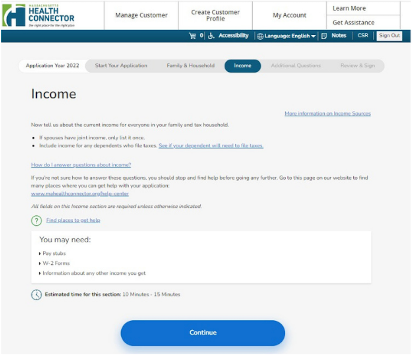
The Income page in the My Eligibility flow, showing navigation and task-recovery issues.
Deep dive finding example 2: My Eligibility flow — Review & Sign page
The page contained walls of text and limited white space, making the experience overwhelming.
Break the page into shorter, well-spaced sections, and present each consent item as a plain-language summary with one clear action — so users can take it in piece by piece instead of facing a single wall of text.
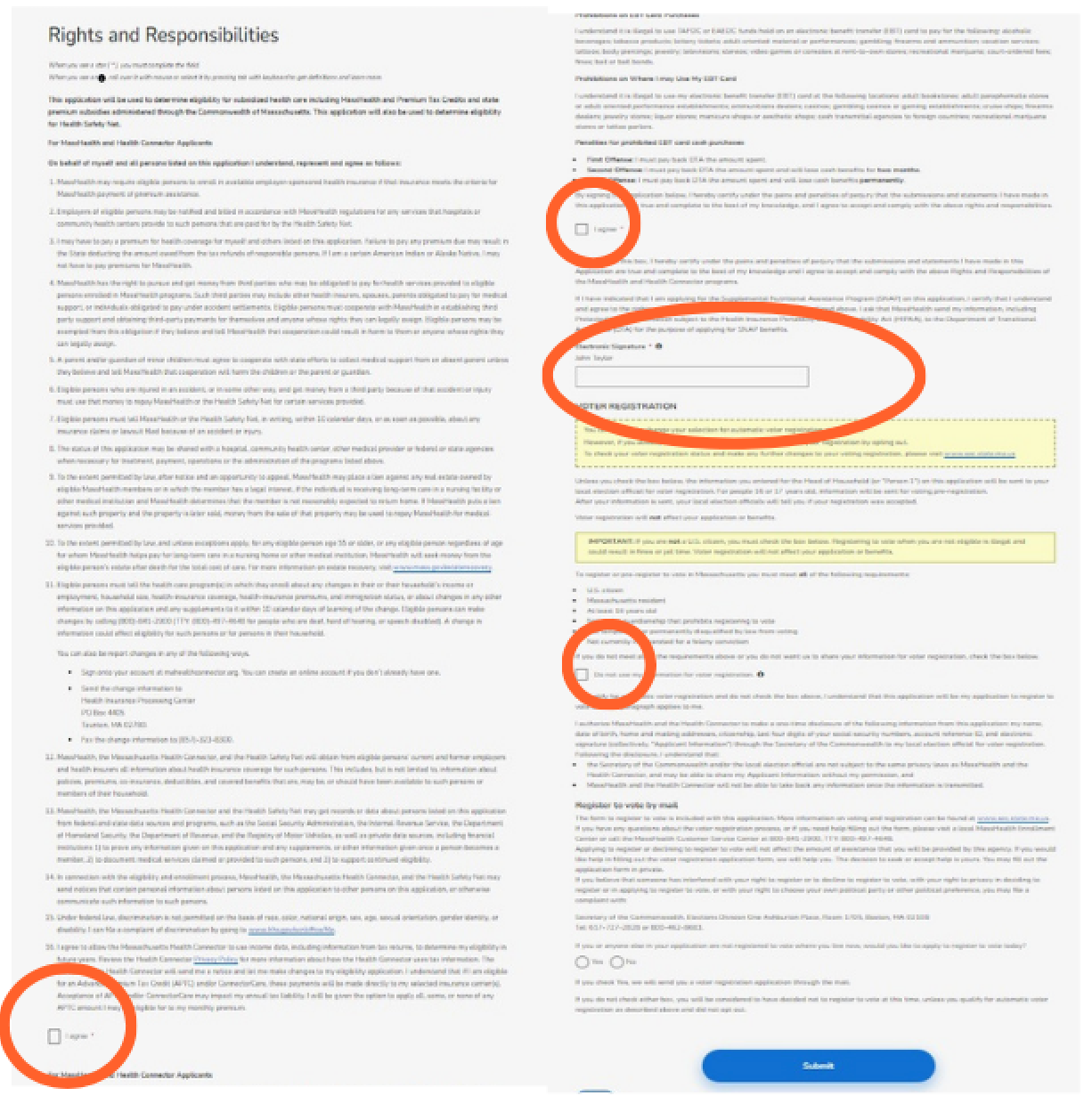
The Review & Sign page in the My Eligibility flow, showing dense content and limited white space.
Design recommendations summary
Recommendations were prioritized to improve navigation, readability, task recovery, and workflow clarity.
IMPROVE NAVIGATION
Support backward and forward movement through completed workflow steps.
REDUCE CONTENT DENSITY
Break long text-heavy pages into smaller, more digestible sections.
INCREASE ERROR RECOVERY
Give users clearer ways to correct mistakes without restarting workflows.
IMPROVE WORKFLOW VISIBILITY
Use progress indicators and subtasks to help users understand where they are in the process.
Implemented design changes
Research findings and recommendations informed later design improvements across key Health Connector workflows.
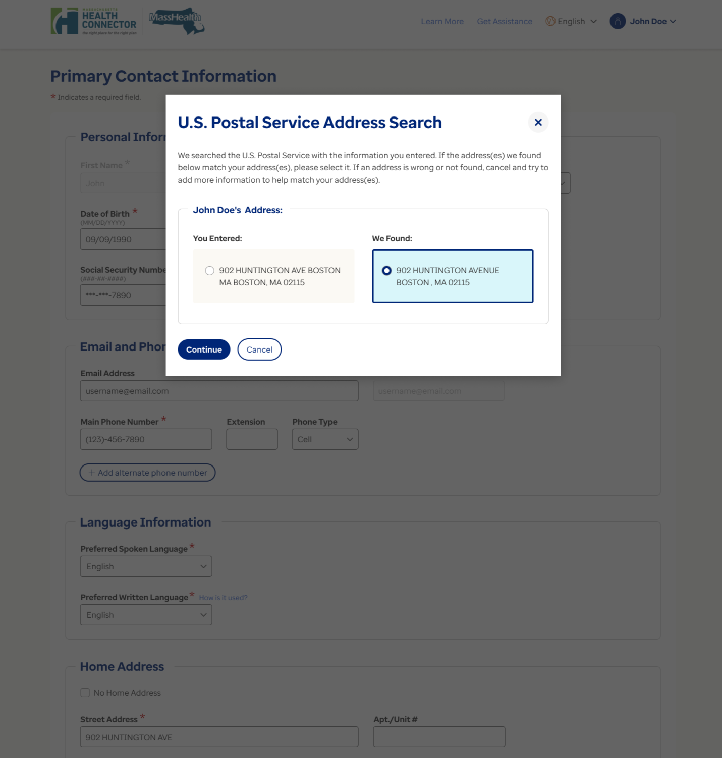
Address validation experience
BEFORE
Legacy address search experience
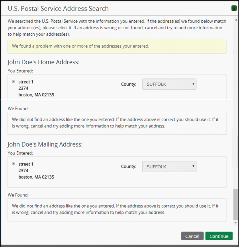
Legacy experience created ambiguity when confirming address matches.
AFTER
Redesigned address confirmation experience
Updated modal improved clarity, selection confidence, and confirmation flow.
My Account dashboard
BEFORE
Legacy My Account experience
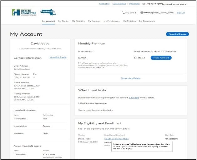
Legacy account experience made it harder to quickly identify next steps and key account information.
AFTER
Redesigned dashboard experience
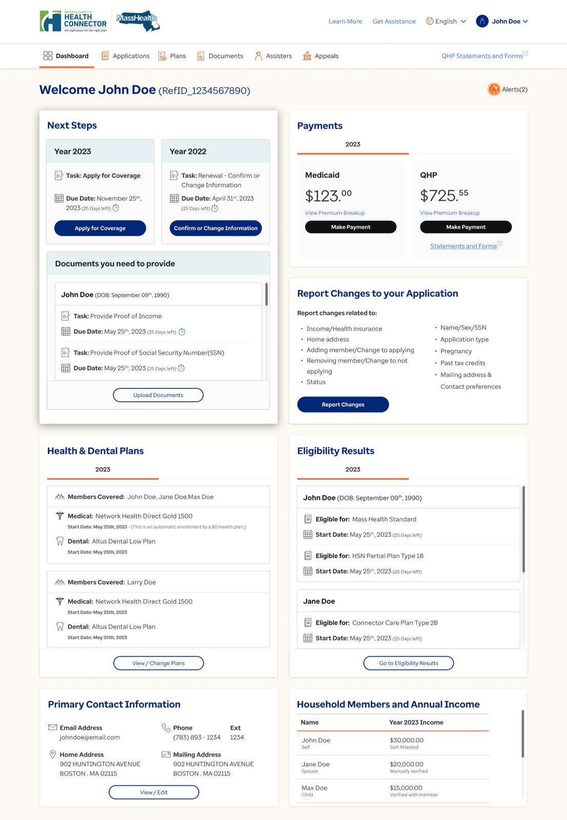
Updated dashboard improved information hierarchy and surfaced next-step guidance.
Research validation
Methodological rigor
4 expert evaluators — independent review, then calibrated together
7 critical enrollment and account workflows, end to end
Monkman (2013) heuristics — a validated evaluation framework
Every issue severity-rated and prioritized (see the severity analysis above)
Qualitative evidence
Navigation barriers reduced error recovery
Content-heavy screens increased cognitive load
Long workflows created unnecessary friction
Users required clearer guidance throughout enrollment tasks
Impact & scale
350K+
Residents served
134
Issues identified
71
Moderate + severe issues
7
Critical workflows
4
Evaluators
1
Unified recommendation set
Reflection
What worked
Using multiple expert evaluators increased issue coverage and helped the team identify usability patterns across complex healthcare workflows.
What I learned
With four evaluators reviewing in parallel, calibration was everything — shared training and a common severity rubric kept independent reviews consistent enough to defend as one coherent result.
What I would improve
I would pair the heuristic review with usability testing and mobile-specific evaluation to validate whether the recommendations improve real user task completion.
This project also reinforced that heuristic evaluation is most powerful when it’s positioned as a strategic tool, not just a QA exercise — the framing of findings for state government stakeholders required as much craft as the evaluation itself.
Led, designed, and researched by Natalie Chiang
More research
Each project tells a different part of the story.
Member Touchpoint Optimization
$22.6M revenue protected
Uncovered the systemic causes of member-communication overload.
View case study → B2B · Internal Analyst ToolHealthcare Explorer Redesign
89% positive · 3 urgent fixes shipped
Caught the silent failures a satisfaction score missed — and shaped the AI feature.
View case study → B2B · Internal Analyst ToolClaim Audit Platform
$20M annual savings · 91.4 SUS
Mapped an eight-plus-system audit workflow into a consolidated redesign.
View case study →